Continuing from the first post about an example of a product that met usability goals and provided a good user experience, now we will tackle an example that fails this assessment.
Let’s talk about NTU Mobile – a school service portal mobile application. NTU Mobile should provide information and services for students and school staff to live, study and work in NTU more conveniently.
The same usability and user experience goals from the first post will be re-used (Effectiveness, Efficiency, Safety, Utility, Learnability and Memorability).
Usability goals
Effectiveness
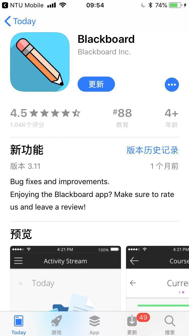
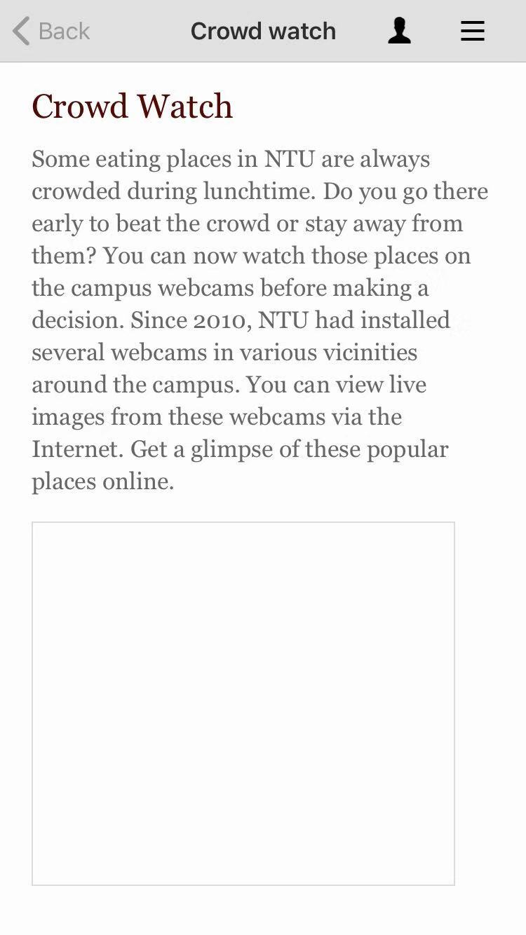
Some of the features of the app are just links to relevant websites or other apps. There are errors that prevent users from doing what the app claims that it can do.
Efficiency
The app always needs updating when new request is made. The app also does not intelligently record user preferences or usage history, so users have to explore from the start every time they open it.


Safety
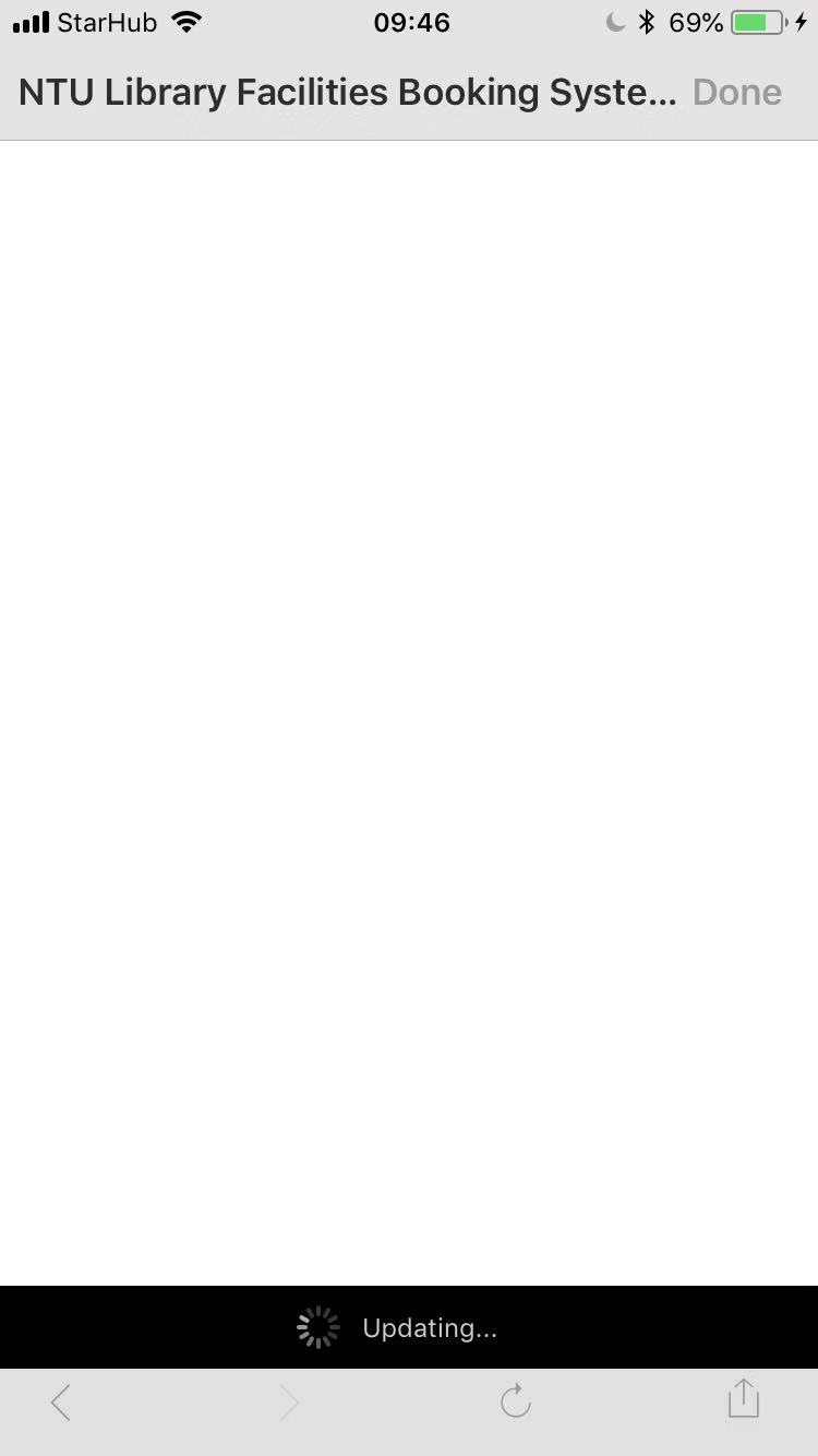
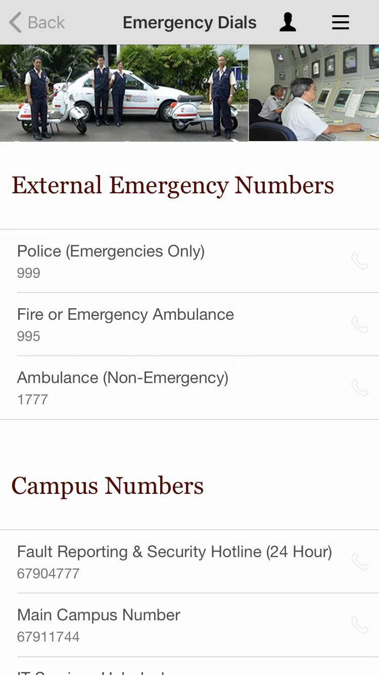
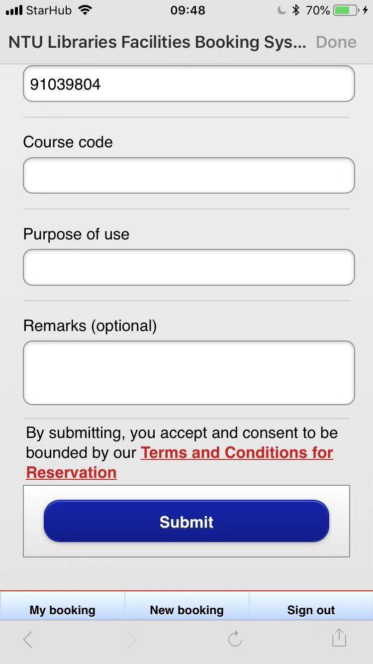
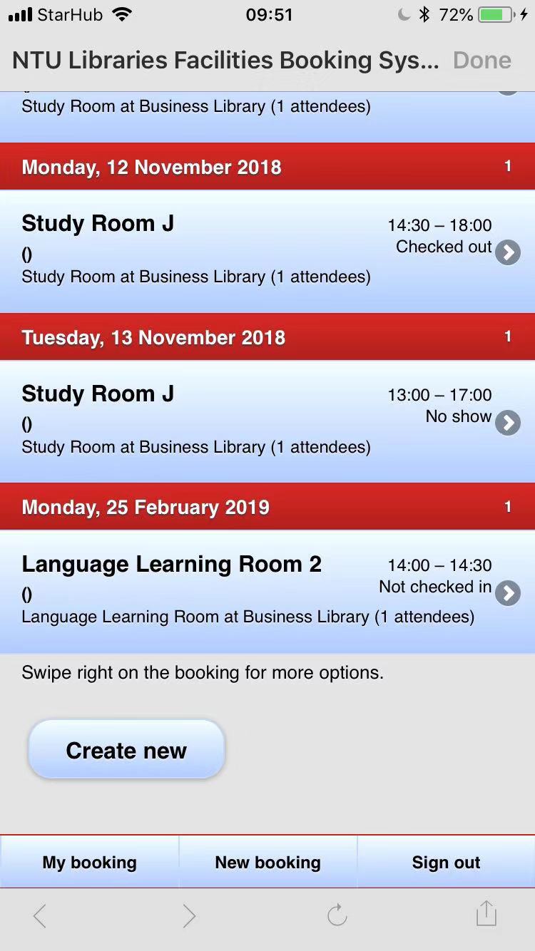
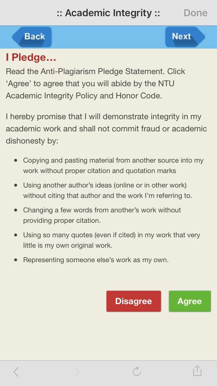
For library facilities booking, there is no confirmation for submitting applications. There is no function for cancelling applications in the app. The lack of recovery means if errors are made. For the academic integrity learning, the agree/disagree button has no use since you can go to next page by clicking next directly.
Utility
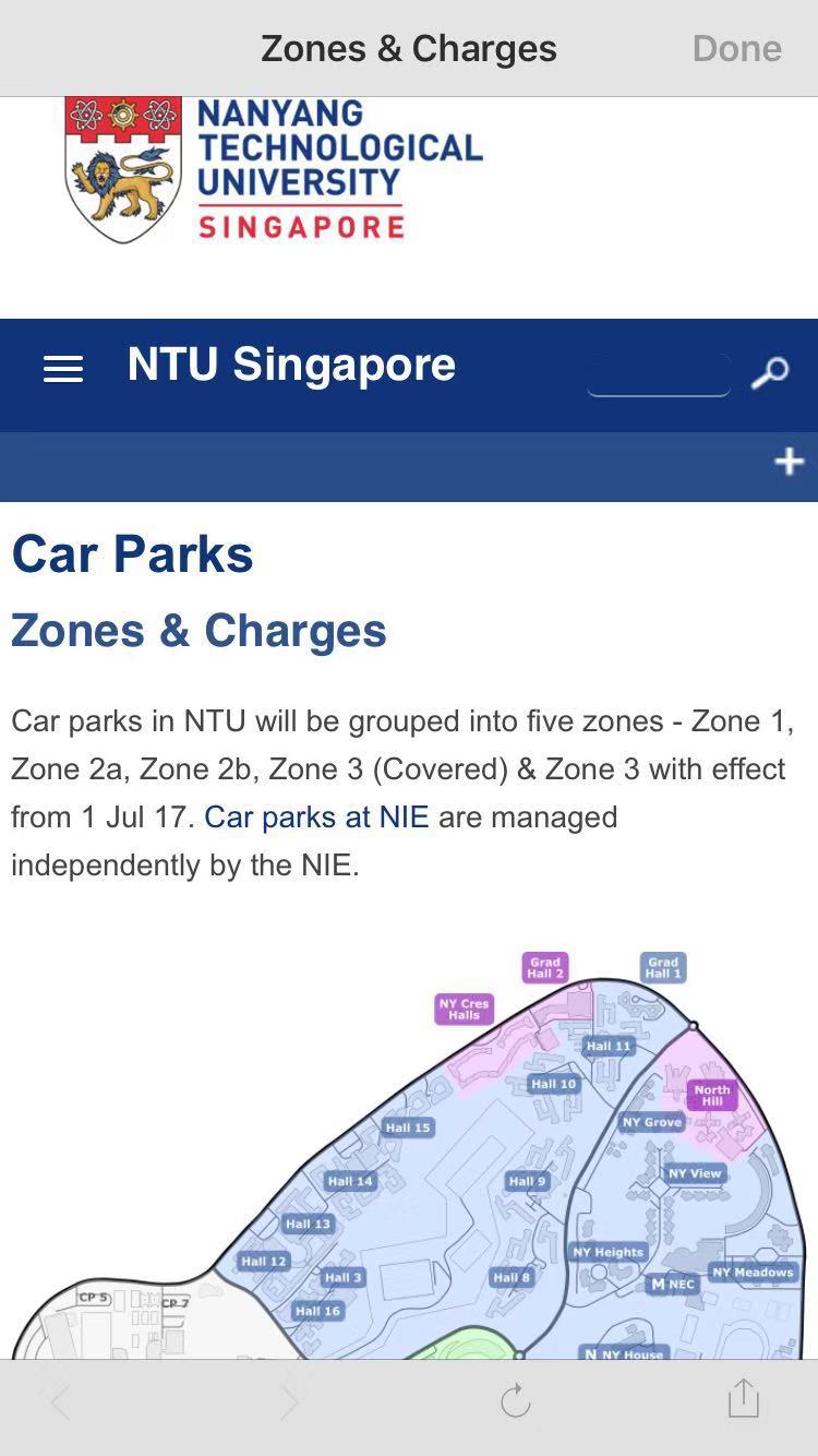
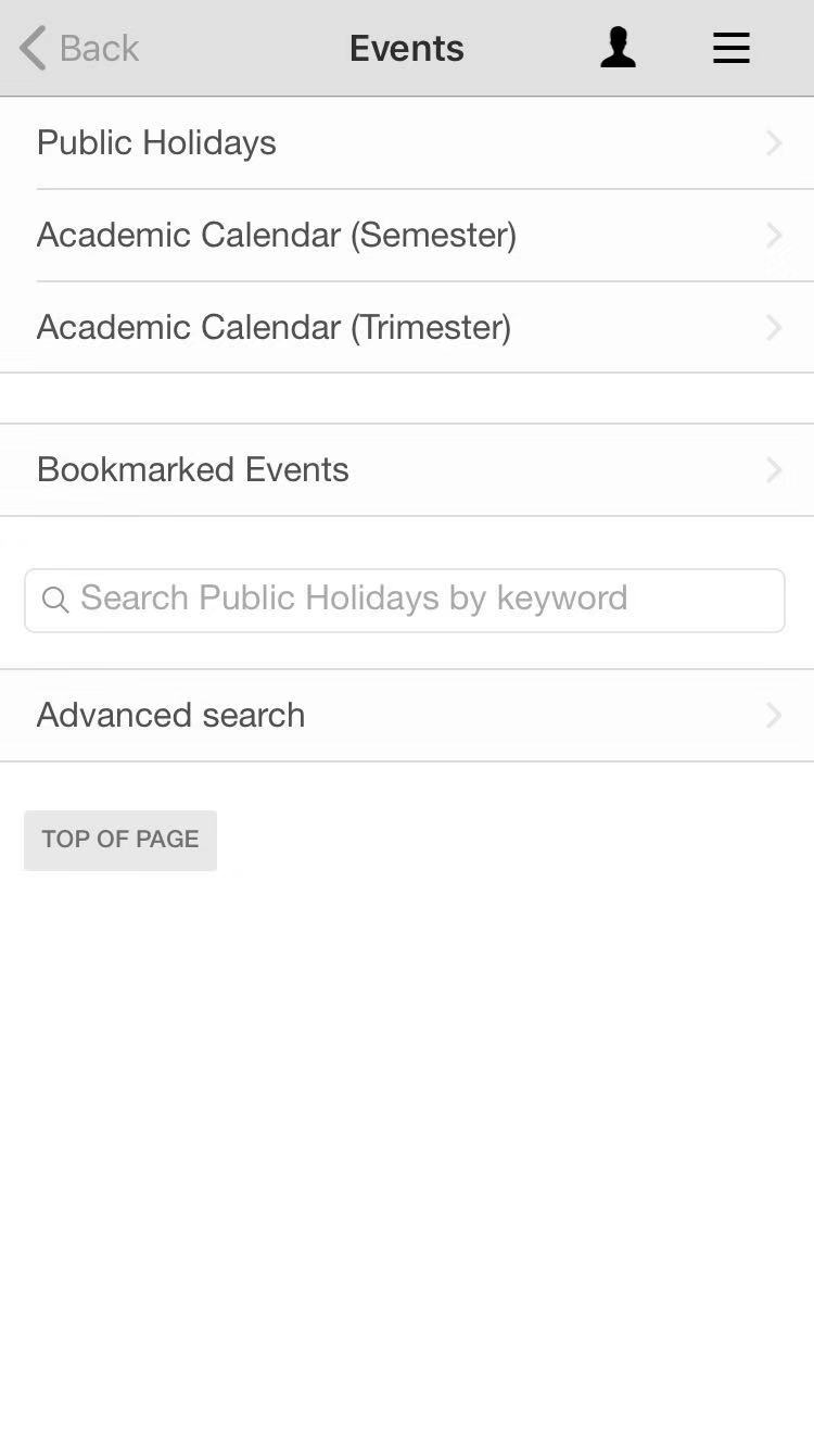
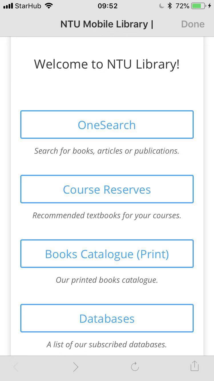
Insufficient functionalities. There are no functions that allow student to check their grades and tuitions, which are highly related to students’ life. There are no information for various student/school events.
Learnability
It is not easy to learn because the naming of certain function and the logic structure of functions for different layers are confusing.
Memorability
Because the logic is confusing, it is hard to remember where is what.

User experience goals
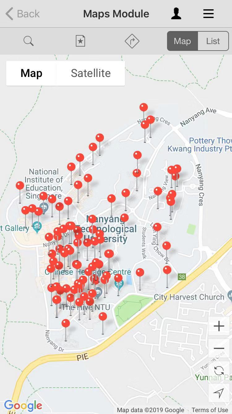
The layout and design of the app is not pleasurable and engaging. There are no icons for different functions so users have to read the name of a function which is confusing for some functions. Lots of functions are just links to other apps and websites, which is not helpful. Therefore, the whole experience of the using the app is not satisfying. The layout and content is fixed, which is boring. The errors and long loading time is frustrating and annoying


This is a very thorough evaluation of the two apps in the aspect of user experience goals. I agree that the NTU mobile app can be quite difficult to use sometimes, I have encountered errors several times when using it.
LikeLike
The formatting on WordPress made the Skyscanner screenshots look like banners and I have developed an automatic-ignore habit for banners, making that particular article harder to read. Probably making the screen shot smaller or within a background would improve readability.
Despite that,bBoth articles are descriptive and well-written to cover the usability and user experience goals of the apps. However, it is a challenge to do a direct comparison because one (the good) is a ‘flight search desktop app’ and the other is an ‘all-in-one university mobile app’.
LikeLike
comment from KitKat:
Interesting article discussing how NTU mobile defeats the usability and user experience goals. I agree that the app is not very useful in helping me know more about NTU. I feel the school should hire your group members for A/B testing next time. 🙂 Keep it up!
LikeLike
Comment from KiwiKiwi:
This is the rest of the last article, right?
Haha, to be honest, I think the user experience of many of the school’s software needs to be improved.
I hope you can do more to let the school see your analysis.
LikeLike