We wanted to tackle good and bad usability goals using two examples of applications we have used for each. The examples will be ranked against a set of usability goals which are taken from the quality components defined by Jakob Nielsen (usability consultant).
This post will discuss an example where the goals are met. A second post will be published with an example of an application that failed to meet these goals.
Usability goals are the objectives that a system wishes to achieve during the user’s interaction with it. The usability goals we’re assessing the examples against are:
- Effectiveness
- Efficiency
- Safety
- Utility
- Memorability
Apart from the above, the system should also satisfy user experience goals. These goals are mainly used to describe how users feel about the system they’re using. Positive UX goals are feelings of satisfaction, motivation, excitement, helpfulness or creativity whereas, negative UX goals can be described as a system being boring, annoying or frustrating to use. (Think of the many times when you wanted to throw your laptop into the bin because some application or website was really difficult to use…)
Let’s get right to it!
Skyscanner – a website that helps you to search for tickets, plan trips and book flights in one place – is on trial today.
I chose this website purely because the moment I opened it up for the first time, it was very intuitive to use and very fresh looking. Without further ado, let’s get right into an analysis of the usability and user experience goals it is achieving so well.
Usability goals
Effectiveness
Does the system do what it’s supposed to do efficiently, enable users to learn how to do the tasks and access the information they need without any trouble?
The answer to this is, yes. The moment a user lands at www.skyscanner.com.sg a big search bar is seen at the top of the page. The website specifically draws attention to this area with the use of an image and leaving the rest of the website background mostly white.
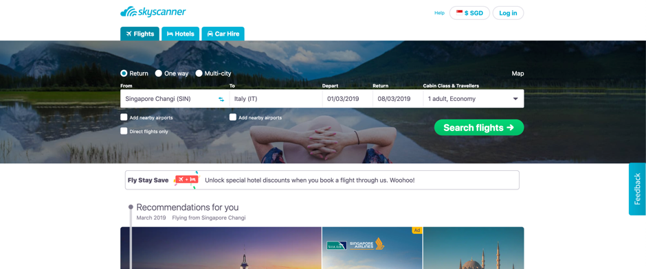
If the user’s requirement was to only search for tickets, it can be done immediately without further thought. The language used is simple and straightforward.
If the user decided to scroll down, they’d discover that there are recommendations and deals listed below. These additional items are not “in your face” and Skyscanner doesn’t force the user to choose any of this.
Efficiency
How well does the system support the users to carry out their tasks? Once these tasks are learned by the user, is it possible for them to maintain a high level of productivity?
Skyscanner’s interface is very intuitive and easy to learn. Even a new user is able to explore the website and figure out what they want to do. None of the tasks have a complicated set of steps to perform and remember for the next time the user attempts the same tasks.
For example, users who are still deciding where they’d like to visit, Skyscanner provides a map with locations that are close to the user’s current location. This map shows the ticket prices at a glance.
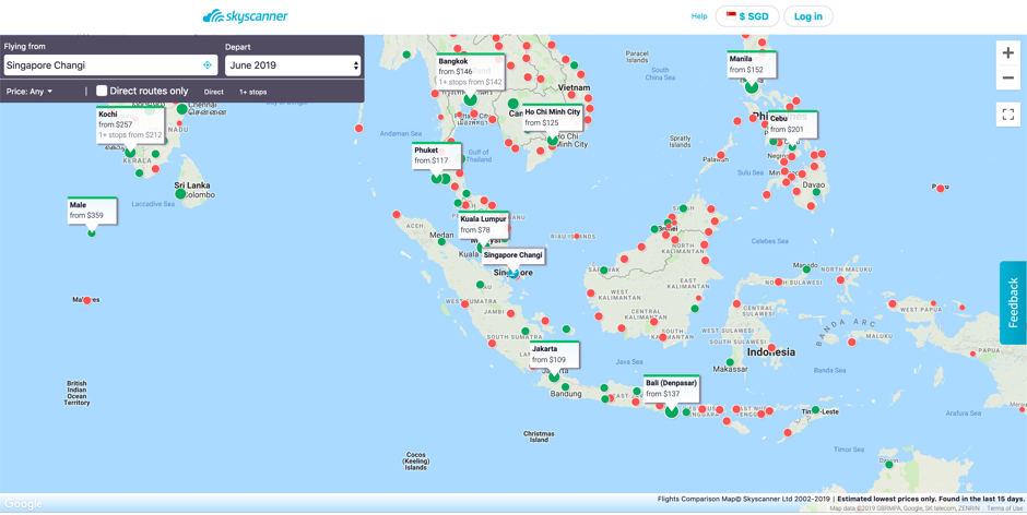
Once a place has been decided, the interface allows users to see more details.
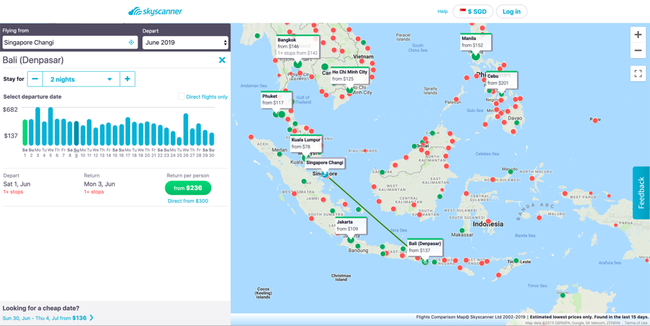
The interface takes the user step-by step through the journey to achieve the user’s objective of finding a location to visit.
Safety
Does the system protect the user from dangerous conditions and situations and prevent them from making serious errors? If they do make errors, does the system allow them to recover from this error with ease?
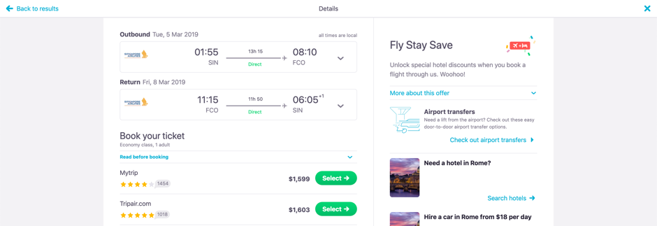
An example from Scyscanner would be, if the user entered the flight details/ dates incorrectly and clicked the search button, they are provided with an option to edit these details in the second page.
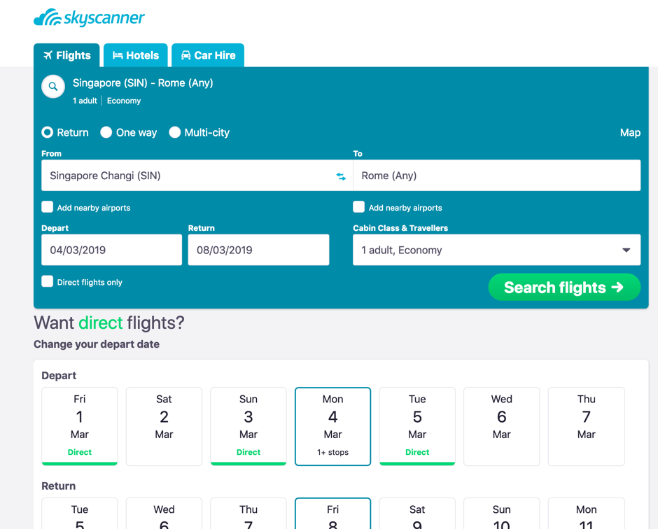
After clicking on “Search flights” and viewing the list of flights and the prices are unsatisfactory, the users can still exit this situation by clicking on the “Back to results” link on the top of the page.
Utility
Does the system provide the functionality that allows users to do what they need to do and carry out these tasks in the way they’d like to do them?
Take a look at the search results page.
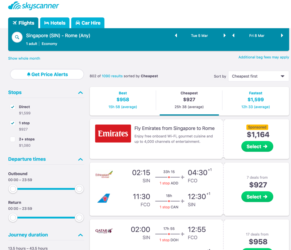
The primary objective of a user using this website is to find the most affordable flights, this website allows users to achieve their objective by allowing the user to play around with the filter until the most desired prices are listed.
Learnability
How easily can the user learn to use the system, including learning to use the main functionalities and then move on to the rest of the tasks?
The search is a prime example of how the core task of ‘searching’ for tickets is on the first page, and there are some basic search criteria on this page. Afterwards, on the search results page, there is an array of advanced filters which the user can explore and learn to use.
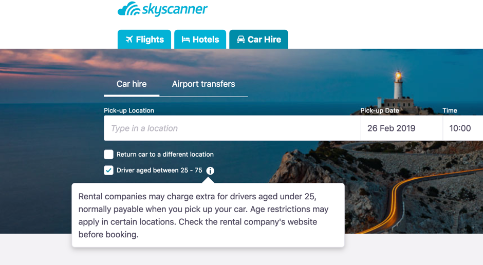
Furtheremore, there are helpful tips on the website that allow the user to learn what certain symbols/ signs are supposed to mean.
Memorability
How easy is the system to remember how to use the next time the user is back? What is the interface support that is being provided by the system to help users how to do certain tasks, especially for operations that are used infrequently?
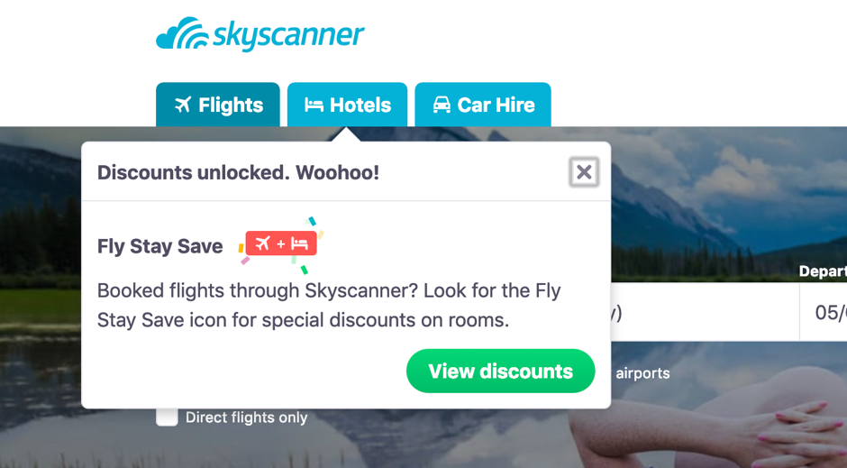
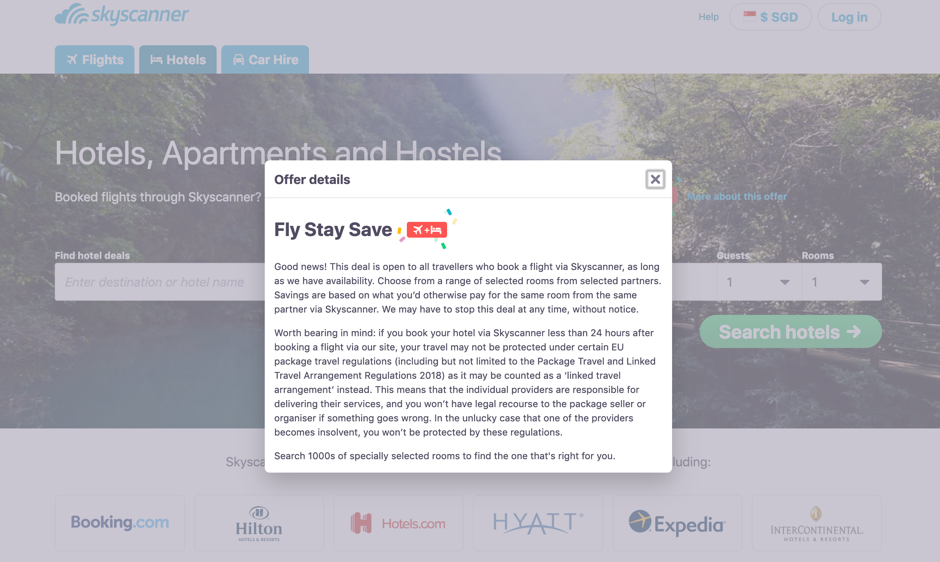
Skyscanner provides links (the “More about this offer” hyperlink which opens a modal pop-up box.) and information icons that pop-up with messages whenever there is additional/ new information available.
User experience goals
A few user experience goals that this site fulfills can be described as:
- Satisfying
- Engaging
- Aesthetically pleasing
- Helpful
- Enjoyable
- Rewarding
The website has been well designed with the use of a good, pleasing color scheme and well placed functionalities. Even new features such as using the map to explore places didn’t take a long time to learn to use, hence the verdict is: this website fulfills its objective of achieving usability goals and providing a joyful user experience!
Sources: https://www.nngroup.com/articles/usability-101-introduction-to-usability/
