Ubiquitous Computing Devices – Usability Issues

This article will talk about positive and negative usability issues that are visible in three ubiquitous computing devices that fall into the inch, foot and yard scale as described by Mark Weiser, who is also called the father of ubiquitous computing.

Inch-scale Device

PDAs, Voice Recorders, smart phones, smart watches fall under inch scale device category. Smart ear buds and smart hearing aids (also called hearables) are a form of inch scale computing devices which we will focus on. There are many in the market now such as Halo Sport, a neuropriming headset for athletes and Oticon Opn the first internet connected smart hearing aid.  There is also a device from called Pilot which translates real-time between users speaking different languages. The Sony Xperia Ear duo acts as an in-ear personal assistant which can deliver news and schedule updates based on location, stream music wirelessly, works with Google assistant and Siri and also responds to gestures.  (Click here for more hearable devices.)

Hearable devices are small and easy to be worn on the body (Image from Waverly Labs)
  • Positive

These devices are placed closed to the ear which provides a closer gateway into brain and body activity thereby enabling this device to track heart rate, blood pressure, temperature, pulse, etc. more effectively than a device worn on the wrist. They are also more accurate than wrist worn devices. The small and lightweight design is also a good idea as it is easier for use.

  • Negative

It’s difficult to have a long battery life on such a tiny device. The average wireless smart earbud/ hearing aid has between 4-5 hours of power which is an inconvenience to users

Foot-scale Device

Picture 1: LG Hub Bot

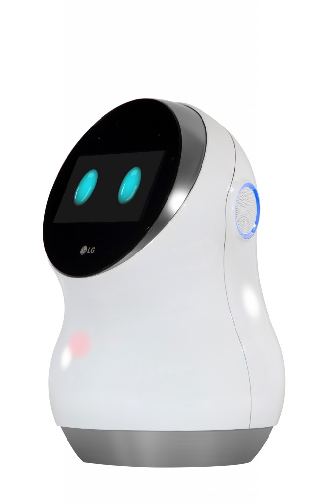
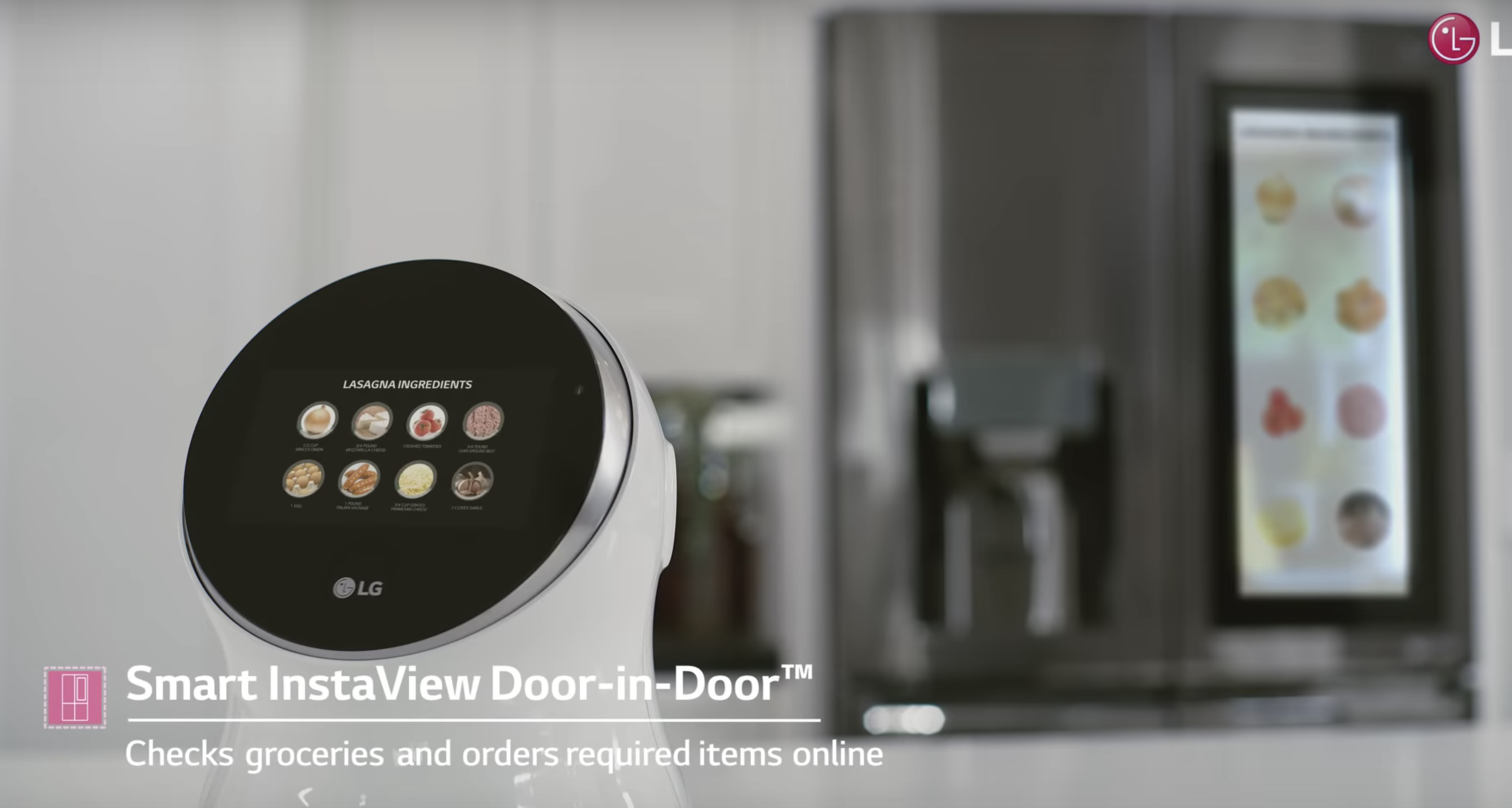
LG Hub Bot is a robot to support smart home running, which looks friendly with a pair of cute eyes. It can be connected to various smart household appliances, monitor them and controls them as human orders. The robot is designed with a screen to provide more visual information to users and also support video calls. This device is considered as a foot-scale device because is middle-sized, and normally not to be carried around. See more on https://www.youtube.com/watch?v=6UgM9-JCfUw

  • Positive usability issues:

Conversational interaction – LG Hub Bot utilize AI to support conversational interaction, which is very easy and convenient for both kids and adults to access. The interaction is so natural just like daily talk with a friend that it “disappears” as weaves itself into the fabric of everyday life and becomes indistinguishable. (2002, Weiser)

Connected with other IoT appliances in home – LG Hub Bot can receive real-time data gathering from sensors of not only itself but also other smart appliances in a house. For example, it can detect the types, qualities and quantities of the ingredients stored in the smart refrigerator. (The pictures below show how the robot can help a mother to organize dinner)

Picture 2: A mother asks LG robot’s advice on what to cook for dinner
Picture 3: LG robot provides an option
Picture 4: LG robot analyze the ingredients needed and refrigerator storage status

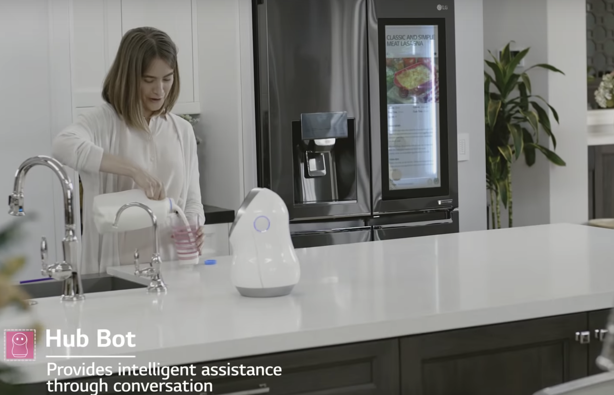
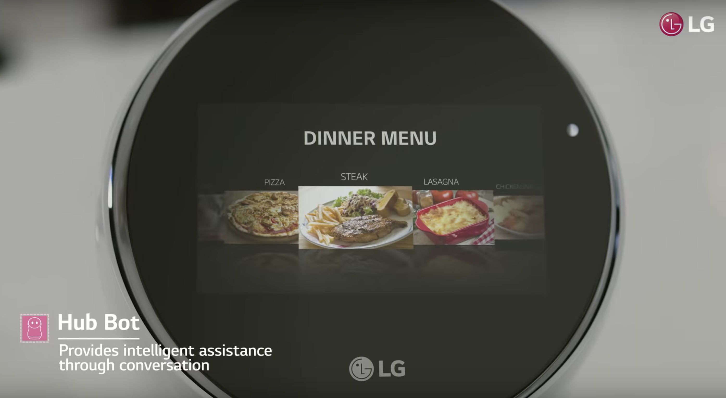
Processing multiple context input – the device can receive contextual input from its own sensors and other appliances’ sensors. It processes the inputs and provides customized service to the house owners. For example, It supports voice recognition so it can differentiate you, your partner and your kids. (Used the framework mentioned in the conference paper: https://ieeexplore.ieee.org/document/5361637)

  • Negative usability issues:

Safety – lots of personal data and house status information is stored in the wireless device. If got hacked, it will be a threat to the family.

Not perfect voice information process technology – when the families say some words what can not be understood by the robot due to accent or uncommon words, the user will be annoyed and frustrated.

Yard-scale Device

Yard scale devices comprises of electronic whiteboards, plasma displays and smart bulletin boards. We will focus on smart electronic billboards which are designed to pick cues from people to enable them to customise responses to them. They are used to target advertisements in a changing environment by sending and receiving data over the internet.

A Swedish pharmacy designed a responsive billboard to discourage smoking which worked with the help of a smoke detector.

Here’s another one made for General Motors, which uses a camera and facial recognition technology to respond to people.

  • Positive

Context based – These electronic billboards can make context based advertisements to users. The products or services offered will be targeted as specific groups so that people are not shown anything that they won’t like, not applicable or not useful to them.

  • Negative

Safety – the device works based on the personal data gathered through a camera from the users. Even though it’s anonymous, it may raise potential privacy concern in the future.

Human’s engagements can be unlimited, which is hard for the avatar to cover all of them. Therefore, when it encounters some actions unrecognizable, users may feel bored and frustrated.

Reference

Picture 1: http://www.lgnewsroom.com/2017/01/lg-expands-iot-ecosystem-with-lineup-of-futuristic-robotic-products/

Picture 2-4: https://www.youtube.com/watch?v=6UgM9-JCfUw

Weiser Mark. (1991). The Computer for the 21 st Century. Scientific American, 265(3), 94. Retrieved from http://search.ebscohost.com/login.aspx?direct=true&db=edsjsr&AN=edsjsr.24938718&site=eds-live&scope=site

T. Mantoro, C. W. Johnson and M. A. Ayu, “A Framework in Ubiquitous Computing Environment for Providing Intelligent Responses,” 2009 Third International Conference on Mobile Ubiquitous Computing, Systems, Services and Technologies, Sliema, 2009, pp. 289-294. doi: 10.1109/UBICOMM.2009.59

Design considerations for social media platforms

The paper we have chosen, titled ” Conceptualizing perceived affordances in social media interaction design”, discusses the importance of perceived affordances and sociomateriality when designing social media site. The authors of this paper have defined social media as a “socio-technical systems, websites or applications that build on Web 2.0 technologies to provide space for social interaction, communication, collaboration, and community formation.”

Sociomateriality: refers to the inseparable nature of technology and human interaction.

Perceived affordance: perceived affordances are what determine usability. or the actions the user perceives as being possible based on how an object is presented. For e.g. if your design includes a “button” make that button look pushable (Donald Norman).

Interaction design of social media

The paper has identified 3 major components in interaction design of social media:

  • Social media as an IT artifact

Two primary embedded attributes of IT artifacts in interaction design are identified: content and form. In terms of the contents of social media, they mainly consist of types and attributes. In terms of the forms of social media, it mainly consists of presentations and the behaviors. Form presentations refer to the static elements, including place location, banner size, color scheme, and media form, etc., while form behaviors refer to some dynamic elements such as movement, flashing, pop-up, etc.

  • User type and role in social media

Designers should attach great importance to carefully consider the types and roles of users when designing the social media and its multi-facet perceived affordances.

  • Application domains of social media

The specific domain which social media belongs to will determine the environment for interactions between social media and users, and different domains may host different rules, norms, and culture, etc. E.g. Facebook was used for creating connections with other people but now it is also functioning as an e-commerce platform.

Perceived affordance in social media

The paper also developed an integrative framework to conceptualize perceived affordance in social media. The authors identified 4 types of perceived affordance that should be considered in social media interaction design:

  • Perceived physical affordances

Perceived physical affordance consists of the elements that can be sensed by users to do physical actions to access the features of a system. In interaction design of social media, vision, audition, and touch are three physical attributes to be considered. For example, speed-aid can help the amblyopic to access the functionalities of social media in spite of their visual issues.

  • Perceived cognitive affordance

Perceived cognitive affordance describes the attributes in social media that can help, support or enable users’ cognitive process. For example, the information provided on social media, such as news, reminders, reinforcement, or suggestions, etc. may influence users’ cognition and thinking process.

  • Perceived affective affordance

Perceived affective affordance exists to trigger or stimulate users’ emotional reactions. For example, social media allow their users to show “like” or “dislike” to the content generated by others, and choose to follow someone they like.

  • Perceived control affordance

Perceived control affordance gives hints of who should initiate the action or interaction, which support users’ willingness to be in control. For example, social media should have the icons or features to let users know that they are allowed to delete something or customize some settings.

Why we chose this paper?

The paper emphasized that not only specific design elements are important for good design, but the user’s mental transformation process should be considered as well. When social media artifacts are designed, they would usually possess a certain degree of affordance (intended affordance) but this may not always be detected by users. This is an important aspect to keep in mind when designing social media sites. The framework conceptualized by the authors on perceived affordances in social media interaction design can also serve as guidelines for designers to recognize proper perceived affordance aspects when designing social media sites.

Click the link below to access the paper referenced for the post above:

Featured

Usability evaluation of software

We have found an interesting case study about how a telco software provider evaluated their software and the methods they used. The company is called Telelogic AB and their software is Telelogic Tau.

Telelogic is a provider of software solutions to the telecommunication industry and has more than 8000 customers and operates in 22 countries worldwide. It was completely acquired by IBM in 2008 and exists under the IBM software group.

Telelogic Tau SDL Suite is a tool for designing and implementing real-time software in the telecommunication industry. It consists of a graphical editor and syntax analyzer, a simulator and validator and several optimized code generators for compilation to executable code.

A sample screen of Telelogic Tau

Two evaluation methods were used to test Telelogic Tau for usability. They are:

  • Questionnaire – quantitative results
  • Heuristics evaluation – qualitative results

Evaluation method 1:

The SUMI questionnaire (Software Usability Measurement Inventory)

  • A commercially available questionnaire (created by Dr Jurek Kirakowski) which is a tested and proven method to measure software quality (user experience) from the end user’s perspective
  • The results are used to measure five usability aspects
    • Efficiency – the degree to which users feel that the software assists them in their work.
    • Affect – the user’s general emotional reaction to the software.
    • Helpfulness – the degree to which the software is self-explanatory. Adequacy of documentation.
    • Control – the extent to which the users feel in control of the software.
    • Learnability – the ease with which the users feel that they have been able to master the system.

How it was done:

  • Questionnaire was shared with 90 selected participants in Europe
  • 62 were properly filled out and returned

Results:

  • Software did not meet the appropriate standards on several aspects of usability
  • Figure below shows that only two of the SUMI scales were above average (Affect and Learnability)
Johan Natt och Dag, Björn Regnell, Ofelia S. Madsen, Aybüke Aurum. (2001).

Evaluation method 2

  • This is a usability evaluation method used to find usability problems in software which can be then solved as part of an iterative design and development process.
  • A set of expert evaluators would examine the interface and assess its compliance with a defined set of heuristics such as Visibility of system status, Error prevention, etc.

How it was done:

  • In Telelogic, there weren’t many usability experts therefore, experts on the software from within the organization was picked
  • They were given specific scenarios and tasks to perform then, given 1 hour to find specific usability problems

Results:

  • 72 usability problems were found (20% highly severe, 65% somewhat severe, 14% less severe)
Johan Natt och Dag, Björn Regnell, Ofelia S. Madsen, Aybüke Aurum. (2001).

Key learnings:

  • These methods can be used even for companies that do not have a lot of experience in usability and user experience engineering
  • Not many resources are required
  • The two methods complement each other very well
  • Management level support is required to successfully carry out any form of evaluation (to accommodate the time and costs required to conduct them)
  • Relatively quick results that are also useful for improvement of the software
  • This study was conducted in early 2000’s on an older GUI but the evaluation methods are still applicable for today’s modern interface

Sources

Telelogic Tau: https://www.eit.lth.se/fileadmin/eit/courses/ets150/IntroSDLSuite.pdf

IBM acquisition: https://www-03.ibm.com/press/us/en/pressrelease/23792.wss

About Telelogic AB: https://www.bloomberg.com/profiles/companies/TLOG:SS-telelogic-ab

SUMI Questionnaire: http://sumi.uxp.ie/

Heuristics evaluation: https://www.nngroup.com/articles/ten-usability-heuristics/

Case study used: Johan Natt och Dag, Björn Regnell, Ofelia S. Madsen, Aybüke Aurum. (2001). An Industrial Case Study of Usability Evaluation in Market-Driven Packaged Software Development. Retrieved from: https://www.researchgate.net/publication/228892229_An_industrial_case_study_of_usability_evaluation_in_market-driven_packaged_software_development

Usability and user experience goals Part 2: Failing goals

Continuing from the first post about an example of a product that met usability goals and provided a good user experience, now we will tackle an example that fails this assessment.

Let’s talk about NTU Mobile – a school service portal mobile application. NTU Mobile should provide information and services for students and school staff to live, study and work in NTU more conveniently.

The same usability and user experience goals from the first post will be re-used (Effectiveness, Efficiency, Safety, Utility, Learnability and Memorability).

Usability goals

Effectiveness

Some of the features of the app are just links to relevant websites or other apps. There are errors that prevent users from doing what the app claims that it can do.

Link to app
Link to website
Errors (disabled feature)

Efficiency

The app always needs updating when new request is made. The app also does not intelligently record user preferences or usage history, so users have to explore from the start every time they open it.

Updating for every tapping
Under “About NTU”
Under “Emergency”
Useful information hidden under irrelevant categories

Safety

For library facilities booking, there is no confirmation for submitting applications. There is no function for cancelling applications in the app.  The lack of recovery means if errors are made. For the academic integrity learning, the agree/disagree button has no use since you can go to next page by clicking next directly.

No confirmation for submitting applications
No way to cancel applications
Useless buttons lead to no effects for the pledge

Utility

Insufficient functionalities. There are no functions that allow student to check their grades and tuitions, which are highly related to students’ life. There are no information for various student/school events.

No information for other students activities

Learnability

It is not easy to learn because the naming of certain function and the logic structure of functions for different layers are confusing.

Confusing naming

Memorability

Because the logic is confusing, it is hard to remember where is what.

Confusing layout

User experience goals

The layout and design of the app is not pleasurable and engaging. There are no icons for different functions so users have to read the name of a function which is confusing for some functions. Lots of functions are just links to other apps and websites, which is not helpful. Therefore, the whole experience of the using the app is not satisfying. The layout and content is fixed, which is boring. The errors and long loading time is frustrating and annoying

Not user-friendly
Not engaging design
Not pleasurable design

Usability and user experience goals Part 1: Achieving goals

We wanted to tackle good and bad usability goals using two examples of applications we have used for each. The examples will be ranked against a set of usability goals which are taken from the quality components defined by Jakob Nielsen (usability consultant).

This post will discuss an example where the goals are met. A second post will be published with an example of an application that failed to meet these goals.

Usability goals are the objectives that a system wishes to achieve during the user’s interaction with it. The usability goals we’re assessing the examples against are:

  • Effectiveness
  • Efficiency
  • Safety
  • Utility
  • Memorability

Apart from the above, the system should also satisfy user experience goals. These goals are mainly used to describe how users feel about the system they’re using. Positive UX goals are feelings of satisfaction, motivation, excitement, helpfulness or creativity whereas, negative UX goals can be described as a system being boring, annoying or frustrating to use. (Think of the many times when you wanted to throw your laptop into the bin because some application or website was really difficult to use…)

Let’s get right to it!

Skyscanner – a website that helps you to search for tickets, plan trips and book flights in one place – is on trial today.

I chose this website purely because the moment I opened it up for the first time, it was very intuitive to use and very fresh looking. Without further ado, let’s get right into an analysis of the usability and user experience goals it is achieving so well.

Usability goals

Effectiveness

Does the system do what it’s supposed to do efficiently, enable users to learn how to do the tasks and access the information they need without any trouble?

The answer to this is, yes. The moment a user lands at www.skyscanner.com.sg a big search bar is seen at the top of the page. The website specifically draws attention to this area with the use of an image and leaving the rest of the website background mostly white.

If the user’s requirement was to only search for tickets, it can be done immediately without further thought. The language used is simple and straightforward.

If the user decided to scroll down, they’d discover that there are recommendations and deals listed below. These additional items are not “in your face” and Skyscanner doesn’t force the user to choose any of this.

Efficiency

How well does the system support the users to carry out their tasks? Once these tasks are learned by the user, is it possible for them to maintain a high level of productivity?

Skyscanner’s interface is very intuitive and easy to learn. Even a new user is able to explore the website and figure out what they want to do. None of the tasks have a complicated set of steps to perform and remember for the next time the user attempts the same tasks.

For example, users who are still deciding where they’d like to visit, Skyscanner provides a map with locations that are close to the user’s current location. This map shows the ticket prices at a glance.

Once a place has been decided, the interface allows users to see more details.

The interface takes the user step-by step through the journey to achieve the user’s objective of finding a location to visit.

Safety

Does the system protect the user from dangerous conditions and situations and prevent them from making serious errors? If they do make errors, does the system allow them to recover from this error with ease?

An example from Scyscanner would be, if the user entered the flight details/ dates incorrectly and clicked the search button, they are provided with an option to edit these details in the second page.

After clicking on “Search flights” and viewing the list of flights and the prices are unsatisfactory, the users can still exit this situation by clicking on the “Back to results” link on the top of the page.

Utility

Does the system provide the functionality that allows users to do what they need to do and carry out these tasks in the way they’d like to do them?

Take a look at the search results page.

The primary objective of a user using this website is to find the most affordable flights, this website allows users to achieve their objective by allowing the user to play around with the filter until the most desired prices are listed.

Learnability

How easily can the user learn to use the system, including learning to use the main functionalities and then move on to the rest of the tasks?

The search is a prime example of how the core task of ‘searching’ for tickets is on the first page, and there are some basic search criteria on this page. Afterwards, on the search results page, there is an array of advanced filters which the user can explore and learn to use.

Furtheremore, there are helpful tips on the website that allow the user to learn what certain symbols/ signs are supposed to mean.

Memorability

How easy is the system to remember how to use the next time the user is back? What is the interface support that is being provided by the system to help users how to do certain tasks, especially for operations that are used infrequently?

Skyscanner provides links (the “More about this offer” hyperlink which opens a modal pop-up box.) and information icons that pop-up with messages whenever there is additional/ new information available.

User experience goals

A few user experience goals that this site fulfills can be described as:

  • Satisfying
  • Engaging
  • Aesthetically pleasing
  • Helpful
  • Enjoyable
  • Rewarding

The website has been well designed with the use of a good, pleasing color scheme and well placed functionalities. Even new features such as using the map to explore places didn’t take a long time to learn to use, hence the verdict is: this website fulfills its objective of achieving usability goals and providing a joyful user experience!

Sources: https://www.nngroup.com/articles/usability-101-introduction-to-usability/

A little something about ourselves…

Hello everyone interested in all things user experience and usability! Welcome to our brand new blog where we will be sharing our insights on current issues and research on UX.

We are Hiruni and Jiaqi, the authors of this blog (we have a team name: HL Group). We are both masters student majoring in Information Systems.

Jiaqi’s interest focuses on user behavior research, specifically information seeking behavioral study. She likes to play Pokemon Go (for research!). Jiaqi will be graduating this year and is hoping to land a super awesome job immediately after that! (Let’s pray for her success).

Hiruni is interested in user experience and is currently researching on dark patterns in UX design. She likes to read and watch movies and rarely steps out of the house when she’s immersed in a book (but she has lots of friends, she insists). She hopes to travel the world and experience different cuisines and cultures when she gets the opportunity to do so (soon!).

Stick around to see more, we promise we’ve got some interesting stuff lined up for you!